I’VE MOVED – WWW.ACYBORGKITTY.COM
Hi all. After a while of planning, I have a new website that collects not just my blog, but also letterpress work, teaching, publishing, and other various endeavors I have going on. Please come see me at www.acyborgkitty.com! And you can follow me on Facebook, Twitter, Tumblr, Instagram, or Medium too.
Dark Things Have Their Origin In Myself
[or notes on reading about the gothic]
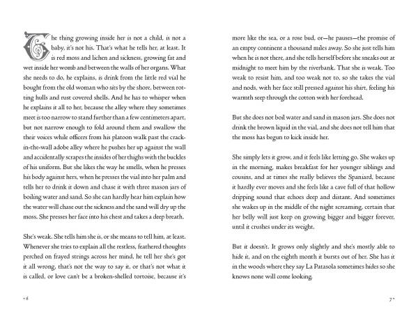
A few months I decided it was high time I stopped denying my ultra-goth aesthetic leanings and instead turn fully into exploring them. This was mostly thanks to the phenomenal collection of essays Dark Museum by Maria Negroni, translated by Michelle Gil-Montero and published by Action Books. I can’t recommend it highly enough. I realized that there is perhaps a way of approaching the gothic as a latinx that would allow me to circumvent the embarrassment/shame I feel whenever I embrace gothic aesthetics in my writing.
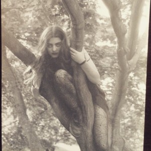
Me, in 1997, a goth girl in a tree.
It also occurred to me, as it has been more and more lately, that the gothic aesthetic, or the things that appeal to me most about it (ornament, sentiment, intensity, passion, excess) are directly in opposition to what is generally the mainstream aesthetic norms in the U.S.A. (minimalist, sterile, ironic, reserved). I wonder about how the gothic is informed by femininity and otherness, or at least how it might be. So inspired by Negroni and a great conversation with Johannes Goransson I decided to try to educate myself about the gothic.
I started with scholarship because that’s where I usually start when trying to educate myself about something new. A Very Short Introduction to the Gothic in fact. And basically according to this book the gothic aesthetic is pretty much invented/owned by the British. That seemed not so accurate to me, but was unsurprising given that the author is a UK scholar and it was published by Oxford University Press. My reading notes:
The Gothic as an aesthetic (architectural) style was invented, like most aesthetic concepts, in retrospect by the Enlightenment humanists. Gothic is the foreign, messy, excessive, dark “other” against which they can define the aesthetic values of their own preferences as order, logic, symmetry. The feminine and the masculine, the gay and the straight, the excess and the order, the dark and the light. Multitudinous, pluralistic, and varied rather than pure/singular.
I’m always more interested in multitudinous and pluralistic, messy and foreign.
Next up: The Cambridge Companion to Gothic Fiction. Where I wondered: is the gothic inherently colonialist? an expression of the fear of the other, the horror and terror of the subjugated on the part of the subjugators? Can the gothic be an anti-colonialist aesthetic?
“The Gothic is the form of western fiction-making, from novels to films to videos (witness Michael Jackson’s Thriller of 1982), where such symbolic ‘abjection’ most frequently occurs precisely because its highly mixed form allows both the pursuit of sanctioned ‘identities’ and a simultaneously fearful and attractive confrontation with the ‘thrown off’ anomalies that are actually basic to the construction of a western middle-class self.”
That expulsion of what is messy and mixed, of what is monstrous and mongrel, allows for the fiction of a unified, stable, singular self, notably a self that is economically stable enough to own property as a crux of identity. But the self as a unity is a lie, the self needs to disintegrate, the darkness needs to inrupt.
“The deep Feminine level, as the Gothic mode has developed, is but one major form of a primordial dissolution that can obscure the boundaries between all western oppositions, not just masculine–feminine… The reason that Gothic others or spaces can abject myriad cultural and psychological contradictions, and thereby confront us with those anomalies in disguise, is because those spectral characters, images, and settings harbor the hidden reality that oppositions of all kinds cannot maintain their separations, that each ‘lesser term’ is contained in its counterpart and that difference really arises by standing against and relating to interdependency.” (11)
Gothic predicated on paradox – hesitates between revolutionary and reactionary (maybe oscillates is a better term).
“Partly because it comes from mixing discourses and postures so blatantly, often with their incompatibilities fully in view, the Gothic can both raise the sad specters of ‘othered’ and oppressed behaviors, crossings of boundaries, and classes of people and finally arrange for the distancing and destruction of those figures or spaces into which the most troubling anomalies have been abjected by the middle class. No other form of writing or theatre is as insistent as Gothic on juxtapositioning potential revolution and possible reaction—about gender, sexuality, race, class, the colonizers versus the colonized, the physical versus the metaphysical, and abnormal verses normal psychology—and leaving both extremes sharply before us and far less resolved than the conventional endings in most of these works claim them to be.” (13, emphasis mine)
The Making of the Covers
7 runs, 9 hours, 4 days, 3 different presses, 3 different covers. Maybe only another letterpress printer will understand the insanity that felt like, getting three of the four handmade letterpress covers for the Anomalous Press 2015 season done in the past week. (The fourth is being printed by the phenomenal Lee Marchalonis, and I don’t even know what it looks like yet, but she’s one of my favorite printers ever!).
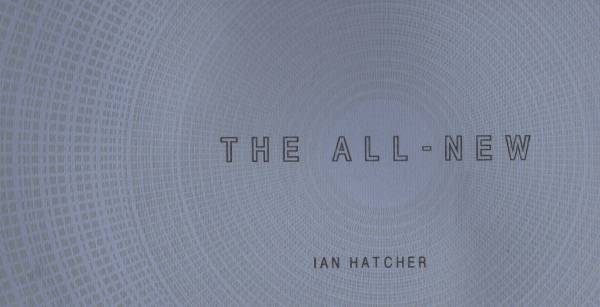
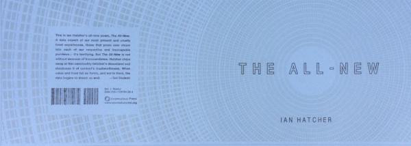
I started out last week with the cover for The All-New by Ian Hatcher, cover designed by Chris Wegman. My first day back on a press since moving to San Francisco, and the only press available last week when I needed to print at the San Francisco Center for the Book was their largest press, a Vandercook larger and heavier than any I’d operated before. Larger than the Universal-I with the automatic carriage I’d run at Brown. And no automatic carriage. So doing the two runs of 170 pulls each was exhausting, and my shoulder felt it for days. But look how amazing the silver ink is on the violet-blue paper (and it’s even more glittery and beautiful in person):
Finishing those in one 4-hour day seemed insane, so what made me think that I could do 4 runs in the next 4-hour printing day? Well, overconfidence, and deadlines, I suppose.
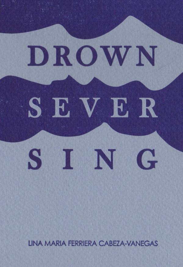
The cover for Drown/Sever/Sing by Lina Maria Ferriera Cabeza-Vanegas was designed by our own A. Kendra Greene to be a beautiful single-run of dark blue on light blue paper. And after deciding to over-ink the form a bit for saturation, I went managed to get it all the way done in under an hour, thanks to the much lighter and faster operation of the Vandercook 4 I was on. I love that the texture of the paper (a gift from Burning Deck Books!) shows through the ink.
Also, Lina realized that the title, translated into Spanish, is equally awesome: Aguar/Cortar/Cantar.
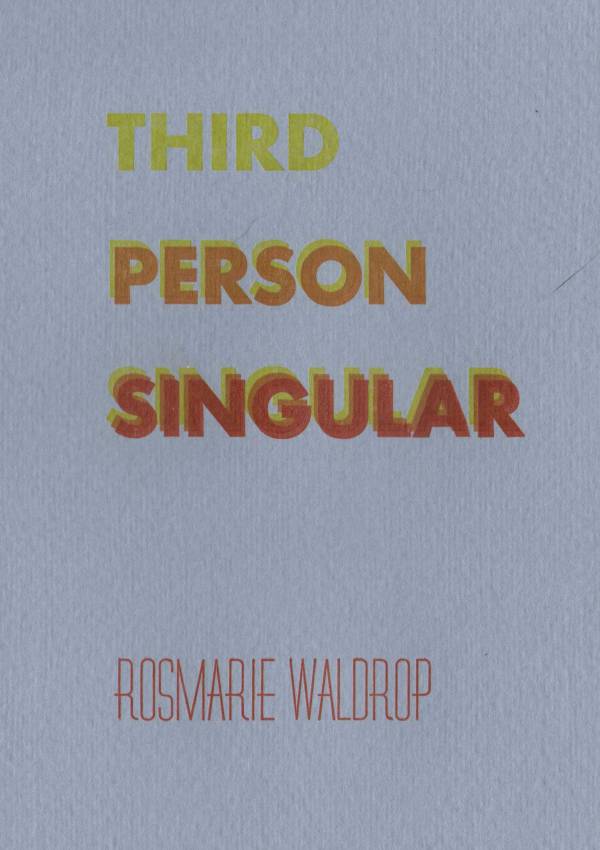
Feeling confident, I decided to set up and try to run 3 out of the 4 colors for Third Person Singular by Rosmarie Waldrop. This cover I designed on-press using the type on hand at the Center, which is my favorite way to print. I was especially happy to find the font I used to set Rosmarie’s name!
I did the whole front, 4 runs of 170 pulls, in under two hours. Yeah. It was crazy, and delightful, and I’m so pleased with how it turned out. So, as if by magic, but in fact by actual insane printing and editing days, these books will be available at AWP. But you can always pre-order them individually or the whole season. Pre-orders help pay for the cost of the making of the book (and guarantee you’ll get one of the 100 limited hand-made covers), so these books are really brought to you by our readers.
My Week In Books
Featherbone.
from Featherbone:
Searshut your throat & open soundless:
again—it pierces your back—
spins—you lurch and plummet—
light is: to blame you: unother.
The light is already bleaching your veins
metasomatized
—blooming in the cracks the fissures.
This is my book, Featherbone. It’s a cyborg feminist retelling of Icarus, driven by compound neologisms. The cover art is by Wangechi Mutu, titled “Love’s a Witch, Orfeo’s Underworld Coronation for Euridice,” 2006. Mutu is a Kenyan-born artist and sculptor who resides in Brooklyn, and is maybe the coolest human alive. We finally got it all off to the printer!
from Drown/Sever/Sing:
“The devil doesn’t always dream, and when he does, if he does, he rarely remembers. It’s all colors and fragments. White plastic spiders on blue strings, silver doorknobs and black rats covered in sugar and broken glass. But sometimes, when he stares into the same spot for a very long time, he sees something sort of like a dream that feels more like someone else’s memory. A sinking boat, a sleepy bird in someone’s hands, an ocelot sneaking into a hen house for the very first time. Then something cracks in the fire, or a stalactite breaks, or the devil finally blinks, or is woken by the whistling of an accordionist walking up the side of the Treinta mountains.”
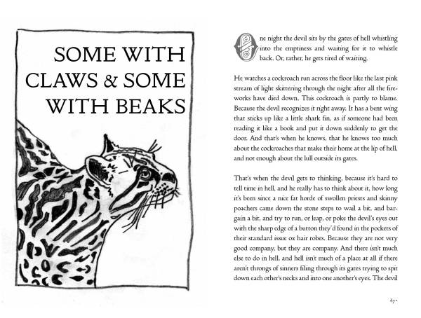
We also finally got all the Anomalous Press interiors off to the printer. This title, Drown/Sever/Sing by Lina Maria Ferriera Cabeza-Vanegas features amazing illustrations by A. Kendra Greene. While Kendra did all the hard work of, you know, actually drawing them, Lina and I spent a lot of time perfecting these stories, and I have to say, this is a damn great book.
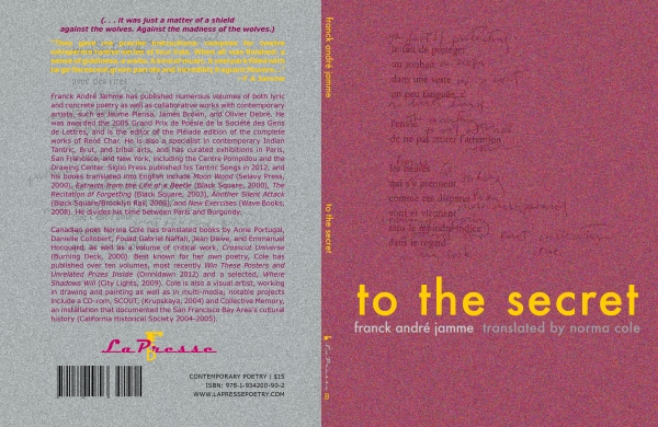
from To The Secret:
these landscapes where
one should be able
at once
to stare deeply
and not find anything more
usual
then
around oneself
I have the great pleasure of designing some books for La Presse, with Cole Swensen. We just got this one off to print too, and you really do want to know these secrets.
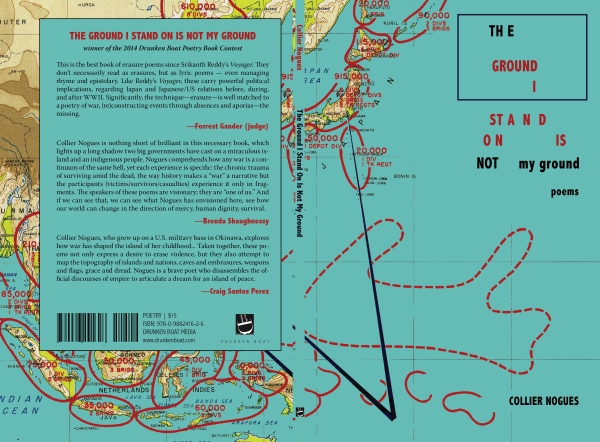
from The Ground I Stand On Is Not My Ground:
I.
Was a person to act as though dying
had become mere?
A kill
was expected of me.
I don’t get to take much credit for this one, the design and majority of the work were done by Collier Nogues and Bailey Lewis, but I did get to dip my fingers in at the end and finalize the files before sending them to print. This book, winner of the Drunken Boat inaugural Poetry Book Contest judged by Forrest Gander, is (as he says) “the best erasure since Srikanth Reddy’s Voyager.” And it’s full of QR codes. Yeah.
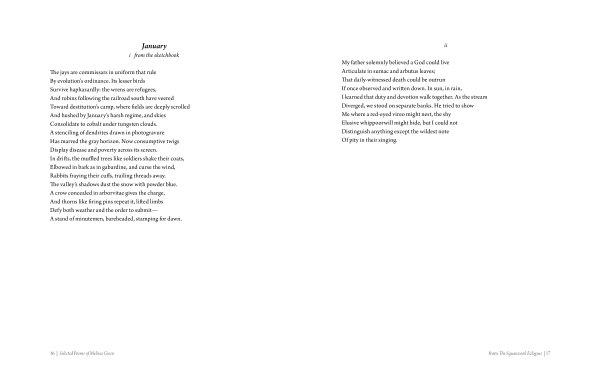 One of my first professional experiences was working with Askold Melnyczuk and Cat Parnell in Boston for Arrowsmith Press, a phenomena of a micro-press that did something like sixteen titles in three years, selling out of almost all of them at these incredible launch-parties. It’s still one of my favorite experiences I’ve had in the publishing world. What was powerful and motivating about that was the excitement and community, the launch parties at Lame Duck Books and the Pierre Menard Gallery (no longer there) in Harvard Square, getting to meet and work with poets like Seamus Heaney, Derek Walcott, Frank Bidart, and Jorie Graham, and getting to put out books by some of the most interesting emerging and some of the most undeservedly lesser-known writers I’ve ever worked with. We did Maureen McLane’s first book, which is still among my favorites. The last title we did before the press went on hiatus in 2007 was Melissa Green’s Fifty-Two, which was one of the most fun to design. So when Askold asked if I’d do another book with them this year, Melissa Green’s Selected Poems, I jumped at the chance despite my over-full plate.
This book is really incredible. I did the design for Jorie Graham’s Selected Poems From the New World with Jorie in the first half of 2014, and I love that I’m now spending the first half of 2015 on another incredible woman in Boston’s selected poems. The book doesn’t have a cover yet, and it’s due out in December 2015, but the ARCs just went to the printer, so I’m feeling pretty excited about it coming into existence as a physical object.
from The All-New:
minute new distinctions flowing over milk teeth pearly trite
superficially all-over calculus
look ! *
math twink sparkling dom poncho shrouding garbage-flagged objects
o ! loveless rag crackling yellow fir relic
rolled to strike a hapless pigeon then calmly recrumpled ; dreck
rewrapp’t
around an old løld rock
unthrown thru an all-new lube maize window
moldering rock coated dry kate moss seeds
trust spores spores sprouting
al l – n e
Printing for the first time at the San Francisco Center for the Book, I used the largest Vandercook I’ve ever been on! I was actually too short to run the press properly, and my shoulder is reminding me of that today, but in two runs (silver, then black) in four hours, I got Ian Hatcher’s all-new cover for his all-new book The All-New done and off to the printer. It was designed by Chris Wegman, and is gorgeous!
What do Rosmarie Waldrop, a penis museum, columbian legends, and code poetry have in common?
The new season of Anomalous Press titles is nearly upon us, and I spent the whole day getting these amazing things off to the printer. (I’m so spacey that I just wrote titles, then it looked wrong so I tried titels, but no, its, definitely titles…) [update: you can now pre-order the whole 2015 season!]
And seriously, I say this every year, but these books are so so good! As always, we’re doing super-limited runs of 100, with digital (but beautifully designed) interiors, and handmade letterpress printed covers. But, for the first time, I’m not printing all the covers myself, nor did I do all the interior designing myself. And we have illustrations! This is actually a very visual season, sort of serendipitously.
Anyway, the whole point of this brain-dead, exhausted post is to share my excitement over these titles, and excerpts of the books. So, with no further ado (wait, is it adieu, no, it’s definitely ado… sigh), the next four Anomalous Press books:
Third Person Singular by Rosmarie Waldrop, with art by Keith Waldrop
This is a beautiful pairing, just like Rosmarie and Keith themselves. Rosmarie’s ellisionary (I know, that’s not a word, but it’s what I mean), elusive sequence in her distinctive poetic voice is complimented by, but not illustrated by, Keith’s collages.
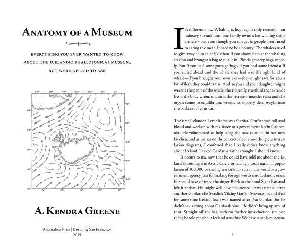
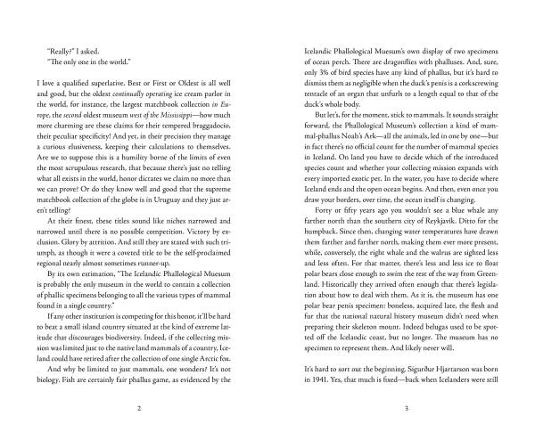
Anatomy of a Museum by A. Kendra Greene, cover letterpress printed by Lee Marchalonis
This book is literally everything you ever wanted to know about the Icelandic Phallological Museum. You probably didn’t even know you wanted to know these things! A. Kendra Greene is a long-time Anomalous contributor, who’s lyrical essays are packed with charm and grace and intelligence and insight, not to mention funny as hell. Take my favorite passage:
Fortunately, the human donation, Specimen D-15-b, is easily missed. Toured clockwise, the main gallery ends at the grid of cubbies you pass coming in. There are three human contributions together in a cubby, underneath the mink specimens and between the dog cubby and red fox cubby. The human phallus is flanked by a jam jar of foreskin, specimen 15-a, and a bell jar of testicles, specimen 15-c. A young boy standing with the famous specimen no more than six inches from his chin turns to ask his mother, “Which one is it?” She checks the catalog and points to the appropriate vessel and the boy jerks away in shock.
“That’s not really what it looks like,” his mother agrees.
As they walk away, the young boy’s younger sister adds matter-of-factly, “It’s probably the inside.” She is wearing pigtails, and she looks so confident in this consolation, so very assured that everything is right after all, that I dare not say what strikes me as the obvious thing: nothing on the inside would be so hairy.
Drown/Sever/Sing by Lina Maria Ferriera Cabeza-Vanegas
This book will haunt you. It is eerie and beautiful and everything that appropriative retellings of Columbian legends with a translation bent should be. If Rudyard Kipling were alive, and Columbian, these are the stories he would wish he could tell.
The All-New by Ian Hatcher
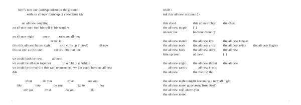 This poem is relentless, just as our obsession with newness (even you, reader, eager to know about the all-new Anomalous books!) is a condition of our consumer-focused society. This poem is not merely critical, it embodies the very rush it critiques, that vertiginous descent into new.
So don’t wait! Pre-order now! The all-new Anomalous Press season!
Small Press Publishing Goals: Making Future People’s Heads Explode
“My mission is to create beautiful, strange little books that a grad student studying the small press movement of the early 21st century will find in a special collections somewhere and they will make her head explode.
Can you give us a preview of what’s current and/or forthcoming from your catalog, as well as what you’re hoping to publish in the future?
Well, last season we only put out three titles, and they were all poetry. Outer Pradesh by Nathaniel Mackey, which we’re now nearly sold out of since he won the Bollingen Prize for it;His Days Go By The Way Her Years by the Taiwanese poet Ye Mimi, translated by Steve Bradbury and which we’re now nearly sold out of since it got reviewed so nicely in a bunch of places; and Mimi and Xavier Start in a Museum That Fits Entirely In One’s Pocket by Becka Barniskis which has turned into an album and a video collaboration.
This season, which will be out for AWP in Minneapolis, we’re doing four titles. Third Person Singular by Rosmarie Waldrop with collages by Keith Waldrop is a gorgeous little sequence of poems that is one of the most beautiful books I’ll have made. The Anatomy of a Museum by A. Kendra Greene is our first non-fiction title, and it’s a book-length essay on the Icelandic Phallological Museum that is quirky and lyrical and should not be missed. The All-New by Ian Hatcher is a text-based poem from a digital literary artist, which is really interesting in and of itself, and the poem is brilliant and political. The fourth is Drown Your Babies, a collection of experimental translations and re-tellings of Columbian myths by the non-fiction writer and translator Lina Maria Ferreira Cabeza-Vanegas.”
I did an interview with Entropy about Anomalous Press: http://entropymag.org/anomalous-press/
Judging A Book By Its Cover (And Interior!)
Form fixed, or flowing? That’s the question I think about a lot in terms of new book forms. Is a particular text flowing, like water, able to shape itself without losing anything to many different containers (page sizes, margins, font faces, leading, etc.) depending on the preference of the reader. Or is a text, like many poems, fixed. The line has to end where it ends or the meaning and artistry of the text are compromised. There’s clearly room in the digital book world for both, though other than PDFs there isn’t a great solution for form-fixed texts on digital platforms like ebooks yet.
But it’s a question that only sometimes comes up when thinking about print design. That is, anymore. Today, it’s not only easy but surprisingly affordable to have a text printed in whatever size book you want (within a range). You want a small square book, 4″ x 4″? Why not! You want a “standard” book size, like 5.5″ x 8″? Easy. You want something really long, say, 10″ x 6″? Absolutely. This is thanks to the dramatic changes brought to printing by the increased quality and easy of digital printing. Digital printing is so flexible, and precise, you don’t even have to work with whole numbers or standard fractions. A book that is say 3.1415926″ x 5.1415926″ might be a bit absurd, but it’s more or less possible.
Oh but it was not always this way. Not even recently. When I started in book design, size was still ruled by standard trims, and lengths based on divisions of a parent sheet into 4s or 8s. So when you started out to make a book, you determined size and page length first, based on what you could afford and what options the printer had available (which were usually limited based on their particular equipment and paper suppliers). Then the margins, and then the text went into it. If some lines were too long, they got edited, or indented to mark that they intended to continue but ran out of room on the page. And authors knew those were the options, and were willing to edit or compromise visually as the case may require.
This was also the reasoning essentially behind presses choosing a book size for their titles, and then never changing it. It made the budgeting easier, the file prep (especially in the days before InDesign saved books), and essentially everything else that goes into the production of a book, easier.
But as I said the advent and improved quality of digital printing in the past ten years or so has changed everything. So much so that when I started my own little publishing venture, Anomalous Press, we designed six radically different books for our first season, each based on the particular demands, tone, and feel of the text. We did a lovely little book of fiction called Ghost by Sarah Tourjee that is 4″ x 6″ in a slim, classic, pocket-sized design. We did a crazy poetry/translation hybrid text called An Introduction to Venantius Fortunatus for Schoolchildren or Understanding the Medieval Concept World through Metonymy by Mike Schorsch that has the trappings of a textbook, complete with assignments like “1. Anologia entis is the idea that any likeness between God and the creature discloses a still greater unlikeness. Compare and contrast.“ It demanded a bigger presentation, and so it is 6.5″ x 8″. The phenomenal English translation of a French image-to-word translation of a Tintin comic Mystérieuse by Éric Suchere, translated by Sandra Doller, needed a graphic treatment that was still evocative of a comic, and so it became a 7″ square book.
I had the flexibility to design from the text into the book, rather than fitting the text into a pre-determined book size that may or may not have worked, but almost certainly wouldn’t have highlighted what was compelling and surprising about the text, because of that digital revolution. And I’m so glad. Because the visual component of literature is important to the way it’s read. Most obviously with poetry, where the line is the measure of its sound, but even with prose. We read something set in, say, Comic Sans very differently than we do something set in Times New Roman. When a page has dense text blocks and narrow margins, it’s more demanding to read, requires more focus and more attention from the reader. But when a prose text block is too light, the margins too wide, the type too big, with too big leading, it feels insubstantial, like a cheap drugstore romance.
It was important to me as a designer, and as a writer, editor, and publisher, to treat each text on its own terms, and I’m very glad I’ve had the chance to do that with my own press. But I do freelance design work for a number of other presses, including several that have a standard set size and form. Within the constraint there are still a lot of ways ways to make each text its own piece. And there is something really lovely about seeing them all lined up on a bookshelf together, a little family of texts. One editor of the series has a rule: no overset lines. She argues that it destroys the music of the line, and I suspect she’s right. Instead, once a book is laid out, she and the author or translator or all three will go over the text and rewrite it to the margins of the book. One author I did a book with did the same for her page breaks, taking them as deeper pauses in the flow of the poem, and knowing that those had to come at just the right moments.
My own first book of poetry Featherbone is coming out this year with Ricochet Editions, and they have a standard size for their books. And so I’m coming up against these issues all over again, from an author’s perspective. I’m struggling to find a way to let the long lines breathe (landscape format?) while still preserving the integrity of the poems on the page and not breaking them mid-poem (which only really works in portrait).
Thoughts? Experiences? Do you judge a book by its visuals?
Canyon in the Body by Lan Lan translated by Fiona Sze-Lorrain
 In many ways this book is exactly what I expected. It is a collection of beautiful, light, lyric poems, in a very traditional translation that is beautiful, light, lyric and focused on image and meaning and very occasionally sound. If this appeals to you, you will love this book.
For me, though, there wasn’t much beyond a few occasional moments that really grabbed me about it. Lan Lan is clearly a finely attenuated poet, one who puts great care into the construction of her poems as image-based description, focused on nature and love, often using one as metonymy for the other. My very favorite moments in the book came as surprises, where the poet herself is inserted into the description in a startling way:
I saw sparrows skim over the roof
with gurgling sounds
I can grow lush wings
and chase them
I can flower, golden or scarlet
until the first heavy snow
Whoever I see becomes mine:
…
Things that can cry will survive
I or a band of night rain
wind in the woods and water sobbing
…
But those moments were few. For the most part the poems are pure image, description, heavily focused on landscape. They on the whole seemed to me a little small, perhaps a little trivial even. But that those were me first thoughts troubled me a little. I wondered, is this a sexist critique? Is this the unexamined expectations of poetry and what is an important subject for poems (i.e. whatever the male gaze decides) determined by the norms of a predominately white male European poetic tradition? The introduction, and one of the blurbs, refers to her as concerned with “domestic” meanings and beauty. Was that somehow prejudicial to my reading?
I don’t have answers. I’d like to believe that my aesthetic preferences are without ethical reproach. But knowing what I do about privilege, and conditioning, I wouldn’t count on it. So I’m left feeling uncomfortable with my apathy towards this book, wondering whether it’s a reflection of valid aesthetic preference or societal conditioning.
One thing I can be sure of, though, is the translation. Not because I read Chinese (I don’t, at all), but because I know how to read translations. It’s essentially unobtrusive, transparent, so to speak, and so tries to efface the translator herself. In this aim, it is extremely successful. There were only things that (I believe unintentionally) drew my attention to the translator. The first was something I noticed right away, that persisted throughout the book, which was the seemingly haphazard use of capitalization and periods. Some lines are capitalized when they are not beginning new sentences, but it doesn’t seem to follow any structural logic. I don’t know if this attempting to preserve something in the original Chinese that isn’t quite conveyed by this English usage, but it consistently drew attention to the English as being not quite normative.
The other was a single passage, in the poem “Now, Untouchable”, which seemed muddy, confused, compared to the general clarity of image throughout. My first thought was that the translator hadn’t quite gotten it.
Shamefully facing a bowl of rice, facing the untouchable
rotten intestines squeeze out wormwood and sobbing
Torrential waves fiercer than the sea are surging under the rubble
enough to destroy a huge rock pressing on my forehead
Overall, though, this is an extremely beautiful book, that will certainly appeal to many readers of contemporary poetry who are looking for a kind of truth and beauty in nature as a reflection of the truth and beauty of humanity.
The Future of the Book
I had a really interesting conversation a few days ago with someone I met on an airplane. I don’t normally speak to strangers in public, as an introvert it actually sort of terrifies me. But something compelled me (technically, my window seat and three teas) to start a conversation with him, and I’m so glad I did. Because it turned out he was extremely interested in the future of reading and the future of the book.
It got me thinking again about reading, and how reading is changing, and how I’d like it to change. And the other day I played a little game with myself and imagined reading the way I would want to experience it, regardless of technology and reality. And here’s the future of the book that I want.
I want a flexible, luminous paper-like material that is capable of displaying both e-ink and high resolution graphics. I want several sheets of that, say, 10-15, at around the size of an iPad mini, but bound together (and stitched in signatures, not perfect-bound, so that it would lay flat easily when opened, but could also be propped up with a stand like a tablet). I want it to have a touch interface, but also allow for the use of a stylus. That is my ideal book.
And when I’m reading it, I want to be able to turn the pages, and the digital text will flow ahead of me, even as I reached the end of the blank pages and started again. It would have to accommodate both free-flowing content (for example, your standard novel), and fixed-form content (poetry, textbooks, hybrid work, and experimental forms that require particular display parameters like indenting or images in specific relationship to the text). And, beyond text-based content both traditional, experimental, form fixed, and form flexible, I would want it to run apps. But not like Candy Crush. Apps like Vniverse, by Stephanie Strickland and Ian Hatcher.
Books as apps that require interactivity. That contain multiple modes of content delivery and generation. Apps like A Humument, which is an iteration of the decades-long art project and erasure poem Tom Phillips has undertaken. Apps like Abra, another by Ian Hatcher, with poets Amaranth Borsuk and Kate Durbin, that works both within and apart from a paper book. I really think that this is one of the most interesting new book forms out there, the app.
I want to be able to have some control over the display of form-flexible content (font, size, color, margin size), but none of those things for form-fixed content and apps. Still, with form-fixed and apps, I want to be able to have margins as an option. Because I also want to be able to write on the pages of this book.
I want to be able to annotate it with a pen, underline, circle, doodle, and highlight, and in different colors. I want also to be able to select text and add it to my notes – like remember back when you were reading textbooks for college classes and you took notes? Well, that’s how I read still. I want my notes to be attached from within the book file that I’m reading, but also accessible apart from it, in an outline format, with quotations selected from the text and linked back to it for easy attribution. But I also want to be able to write notes and summaries with either a stylus or a wireless bluetooth keyboard.
And I want it to link to my Goodreads bookshelf, because that’s how I keep track of everything that I’m reading. Ok, almost everything. With an ISBN number. But I want the process to be more fully automated. That it knows what page I’m on, that I can go from my notes to a review that is public and publishable on my blog, and on Goodreads, without having to switch from application to application.
Oh, and I want to be able to tweet excerpts as I’m reading. Not copy and paste into my Hootsuite app, and then fiddle with it to get it to 140 characters, plus the #amreading hashtag, and #poetry or #translation or whatever else is appropriate. I want to be able to select the text in the book and right-click or use some other shortcut gesture to indicate that I want to tweet that excerpt, and have it open a dialog where I can add the appropriate hashtags, @s or whatever else I may want. And then that can go to my Twitter, and/or my Facebook and/or my Google+ and/or my Tumblr. And also to my notes on the book, because if I think it’s good enough to share I probably want to remember it. A second kind of notes file on the book: quotations.
And, I want to be able to listen to music through this device as I’m reading. I want to have the option to listen to music the author recommends, or music that I select. And as an author I want the option to say “here, listen to this while you read my poetry.”
Finally, I want the ability to share my marginalia and annotations, either publicly or with just a few people. Lots of control over that – not just “all the marginalia” but at the level of each annotation with different sharing options.
That, my friends, is my future of the book. Wake me when we get there.
That Time I Had To Look Up “thot”
I’ve been called many things by many people. I’ve also been called many things by many people who think I’m this Erica Mena, and not the Erica Mena I actually am. It’s because I have a googleganger. And it so happens that, though I am slightly older than her and so have our name on most social media platforms (from before I even knew about her), she is much more “famous.” I use the scare-quotes because she’s a reality TV “star,” famous for being dramatic and pretty, and had we not had the same name I never would have heard of her.
I learned about her, and the reality TV world she is a part of, around Christmas in 2010 or so. Since I’m @ericamena on Twitter, and I use it primarily for literary purposes, I had until then set it to send a text to my phone anytime someone tweeted at me. And one night, my phone blew up. You hear that phrase, but can’t imagine what it means unless you have received several dozen hate-tweets sent directly to your phone in a matter of minutes. It was startling, especially because they were so nasty. It became clear to me almost immediately that they weren’t actually meant for me, but there’s still something unnerving about a large number of strangers insulting you and telling you to go die. I turned off my notifications, responded to a few who were tweeting over and over that they had the wrong user (and even got one or two apologies!), and blocked the rest.
Then I started getting emails for her. Start-up fashion designers, make-up artists, music producers, asking me to work with them, wear their clothes, etc. I even got proofs emailed to me of a photo shoot she did. And then Instagram. I get tagged all the time in weird club scenes. I’m followed by approximately 600 people who think I’m her. Once someone even managed to “chat” me through my email in a way that came right to my phone. That was unnerving, and my husband figured out how to turn all that off, thank goodness. You know, neither of us owns our name.com though. I keep thinking I should buy it, but it’s now a “premium” domain, and out of my price range.
Every now and then I check my direct messages on Twitter, just to see if I’ve missed something really intended for me. And that’s how I first heard the word “thot.” Thot, according to Urban Dictionary, is a slang term for hoe, whore, slut, or any other pejorative you might use to sex-shame someone (usually an attractive woman). It originated as an acronym for That Hoe Over There, and is now it’s very own hashtag on Twitter.
It doesn’t bother me, being called a slut, or a whore, or a hoe, or a thot. Not only because I know these insults aren’t meant for me, but because I don’t really understand why they would actually matter. I’m a feminist, and progressive about just about everything, sex included. I think it’s perfectly fine for women to have “sex for pleasure” as the Urban Dictionary definition indicates is partly what makes someone deserving of being called a thot. I think it’s fine for women (and men) to have more than one partner at a time, so long as it’s all safe and consensual.
Of course the kind of people hurling these insults via Twitter are, to put it mildly, not the great minds of the world. They are the kind of people who watch reality TV, and do it often enough that they become personally invested in the lives of people they’ve never met, and will never meet. They become so invested (dissociative?) that they feel compelled to try to hurt these people because of the perceived hurts they themselves feel at the strangers’ behavior. So it’s not terribly surprising to find the same old misogynistic vitriol spilling out of the virtual mouths of these people.
During the few months when the other Erica Mena was in a same-sex relationship with one of her co-stars I had some hope. Suddenly she seemed like a public figure doing some work for bisexual awareness, and general sexual progressiveness. All of a sudden, lesbians and bi women were tagging me, and praising me. It made me feel a little optimistic about the reality-TV effect. But when she became engaged to Lil’ Bow Wow, all that stopped, and even the lesbians and bisexuals, those supposed bastions of progressive sexual politics, resorted to the tired language of slut-shaming.
